
- Who Was Gerardus Mercator? The Man Behind the Map
- Charting a True Course: The Real Reason for the Mercator Projection
- The Great Distortion: Why Greenland Looks as Big as Africa
- The “Racist Map” Debate: A Clash of Intent and Impact
- Recap: Reading Between the Lines of Any Map
For centuries, it was the world map most of us knew. Pinned to classroom walls and used in atlases, the Mercator projection gave us a clean, rectangular view of the planet. But this familiar image is also profoundly misleading. Its distortions have sparked a heated debate, including the serious accusation that it is a “racist map” designed to promote a colonial worldview.

This article will explore the evidence behind the Mercator projection. We will look at why it was created, how its distortions work, and critically examine the controversy it still causes today. To do this, we will bring together different historical and technical perspectives to give you a clear, balanced understanding of one of history’s most important and contested maps.
Who Was Gerardus Mercator? The Man Behind the Map

To understand the map, we must first understand its creator. Gerardus Mercator (1512-1594) was a Flemish cartographer who lived during Europe’s “Age of Discovery” (Brown, 1951; Karrow, 2004). This was a time of intense global exploration, and sailors urgently needed better maps to navigate the vast, unknown oceans. Mercator was more than a mapmaker; he was a skilled engraver, instrument maker, and scholar (Karrow, 2004). His work was a direct response to the practical challenges of his era, a time when old maps were no longer good enough for a rapidly expanding world.
Charting a True Course: The Real Reason for the Mercator Projection
In 1569, Mercator published his famous world map with a very specific purpose in mind: navigation. Its full title, translated from Latin, was “New and more complete representation of the terrestrial globe properly adapted for use in navigation” (Monmonier, 2004; Mercator, 1569, as cited in Crane, 2002). This title is key evidence of his original intent.
The map’s genius was that it allowed sailors to plot a course of constant compass bearing, known as a “rhumb line,” as a perfectly straight line (Monmonier, 2010; Snyder, 1993). On a globe, this line is actually a curve that spirals towards the poles. By representing it as a straight line, Mercator made plotting a ship’s course simpler and safer.
To achieve this, Mercator had to make a compromise. He designed a map where the lines of longitude were parallel, instead of meeting at the poles as they do on a globe. To keep angles accurate for navigation, he had to stretch the map vertically more and more as he moved away from the equator (Snyder, 1993; Osborne, 2014). Mercator knew this would distort the size of landmasses. He was willing to sacrifice accuracy in area to achieve perfect accuracy in direction for sailors (Monmonier, 2010; Brotton, 2012). It was a deliberate trade-off, not a mistake.

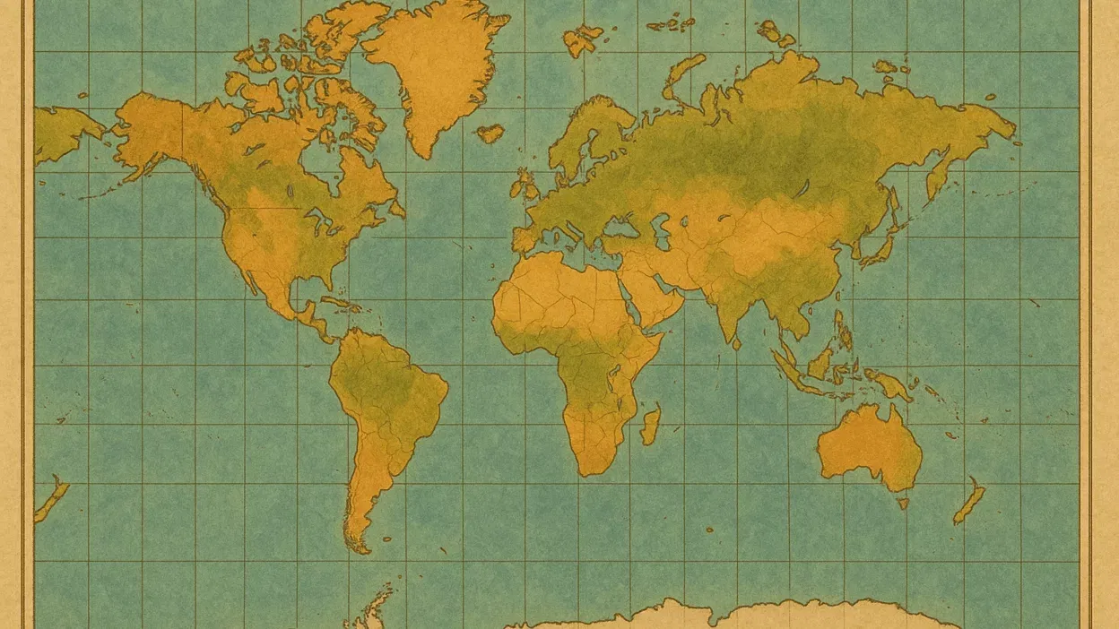
The Great Distortion: Why Greenland Looks as Big as Africa
The most famous flaw of the Mercator projection is its massive distortion of area. Landmasses far from the equator appear much larger than they really are. This leads to some shocking visual comparisons:
- Greenland vs. Africa: On the map, Greenland appears to be roughly the same size as Africa. In reality, Africa is about 14 times larger (Snyder, 1993; Scharfe, 2002).
- Europe vs. South America: Europe looks bigger than South America, but South America is almost twice its size (Scharfe, 2002).
- Alaska vs. Brazil: Alaska appears to take up as much map space as Brazil, even though Brazil’s actual land area is nearly five times larger (Snyder, 1993).
This distortion happens because the map is stretched to keep angles correct for navigation. The further a place is from the equator, the more it is stretched, and the more its size is exaggerated. This feature, which was necessary for the map’s original purpose, is precisely what makes it unsuitable for general use in classrooms or for showing global data.
The “Racist Map” Debate: A Clash of Intent and Impact
In the 1970s, a major controversy erupted, led by German historian Arno Peters. He claimed that the Mercator projection promoted a “colonialist and racist” worldview by enlarging the countries of the “Global North” (mostly Europe and North America) while diminishing the relative size of countries in the “Global South” (especially Africa and South America) (Kaiser, 1987; Scharfe, 2002). Peters promoted an alternative, the Gall-Peters projection, which shows all countries at their correct relative size.
This accusation became a central part of the “Map Wars” of the 1970s and 80s (Monmonier, 2004). To critically evaluate this claim, we must separate Mercator’s original intent from the map’s later impact.
- The Argument for Intent: Most historians and cartographers argue that accusing Mercator of racist intent is anachronistic—that is, it judges a 16th-century person by 20th-century standards (Monmonier, 2010; Brotton, 2012). There is no historical evidence from Mercator’s own writings to suggest he meant to belittle any region of the world. His goal was purely technical and navigational (Crane, 2002).
- The Argument for Impact: While the intent may not have been racist, the impact of using the map in a different context is another story. When the Mercator projection became the standard map in schools during the age of European colonialism, its distortions visually reinforced a Eurocentric worldview. The map made powerful colonial nations in the north appear larger and more dominant, while colonized nations near the equator appeared smaller. The map didn’t create these biases, but its visual properties aligned with them (Brotton, 2012; Monmonier, 2018).
Therefore, while it is inaccurate to call Mercator’s 1569 design an act of deliberate racism, it is fair to critique the unthinking use of his map for general education, as its impact could have unintentionally supported colonialist and Eurocentric views.
Recap: Reading Between the Lines of Any Map
The story of the Mercator projection teaches us that no map is a perfect reflection of reality. All maps are tools created for a purpose, and all maps distort the world in some way. The Mercator projection is an brilliant tool for navigation, but a poor choice for a general-purpose world map.
The controversy it sparked was valuable because it made us all more aware of “map literacy.” It taught us to ask critical questions: Who made this map? Why did they make it? What does it distort? Today, mapmakers often use compromise projections, like the Winkel Tripel (adopted by National Geographic in 1998), which try to balance distortions of size, shape, and distance (Schell, 2002; Snyder, 1997).
The Mercator map is not evil, but it is a powerful example of how the tools we use to see the world can shape our understanding of it. Its legacy reminds us to always think critically about the images we are shown and the stories they tell.
References
Brotton, J. (2012). A History of the World in Twelve Maps. Viking.
Brown, L.A. (1951). The Story of Maps. Little, Brown and Company.
Crane, N. (2002). Mercator: The Man Who Mapped the Planet. Weidenfeld & Nicolson.
Kaiser, W.L. (1987). The new‐look world of Arno Peters. Cartographic Information, (15), pp.1-4.
Karrow, R.W. (2004). Gerardus Mercator. In Oxford Dictionary of National Biography. Oxford University Press.
Monmonier, M. (2004). Rhumb Lines and Map Wars: A Social History of the Mercator Projection. University of Chicago Press.
Monmonier, M. (2010). How to Lie with Maps. 2nd ed. University of Chicago Press.
Monmonier, M. (2018). How to Lie with Maps. 3rd ed. University of Chicago Press.
Osborne, C.P. (2014). The Mercator Projection. In: Cartography – A Compendium of Map Projections, with Derivations.
Scharfe, W. (2002). World Atlases for Public Use. In: D. B. McMaster & W. Scharfe (eds.), Development of Thematic Atlases and their Use. International Cartographic Association.
Schell, J. (2002). The Unconquerable World: Power, Nonviolence, and the Will of the People. Metropolitan Books.
Snyder, J.P. (1993). Flattening the Earth: Two Thousand Years of Map Projections. University of Chicago Press.